Colour theory
1. The wavelengths of warm
colours are longer so your eyes see them sooner than the shorter
wavelengths of cooler
colours. Using warm colours in the foreground of a painting and cool
colours in the background
of a painting can help create the illusion of miles of distance in a
landscape and of a more
shallow depth of space in a still life painting.’
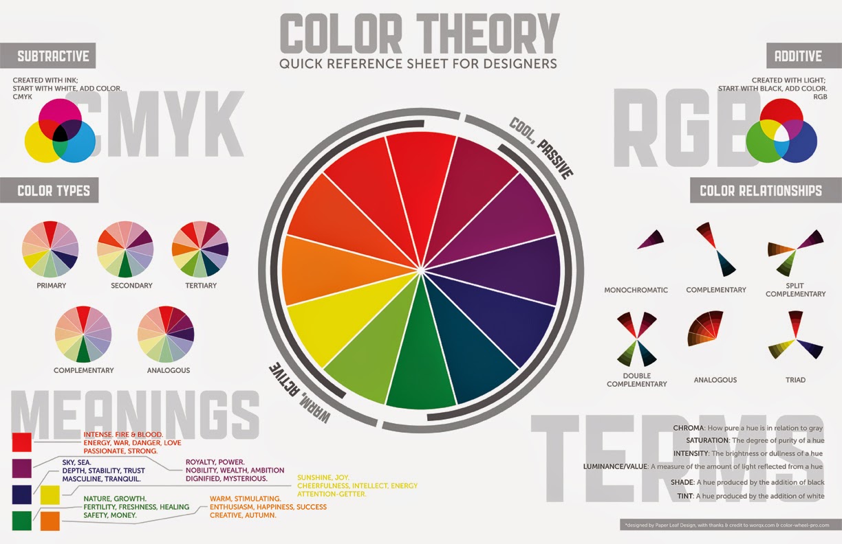
As explained above, the temperature (hue) of a
colour is an effective tool to demonstrate depth in
an artwork. It can also be displayed by varying the colour saturation (chroma) and brightness (value) and of fore, mid and background elements.
Here is a video on HUE SATURATION AND BRIGHTNESS in ADOBE ILLUSTRATOR.
Here is a video on THE COLOUR PICKER in ADOBE ILLUSTRATOR
Here is a link to ADOBE TV ILLUSTRATOR CS6
Here is a link to ADOBE TV ILLUSTRATOR CS6
Task 1 - Open your own A4 Illustrator document and repeat what is shown in these videos
________________________________________________________________________
2. Here are some examples of using hue, saturation and brightness to create depth
Hue
Warm colours come forward while cool colours recede.
Warm
Cool

Saturation
Saturated or high chroma colours come forward while unsaturated recede
Saturated
Unsaturated

Brightness
Bright colours come forwards darker colours recede
Bright
Dark

Van Goghs' image uses several of these tricks to enhance depth

Vincent Van Gogh, Café Terrace on the Place du Forum, Arles, 1888.
Task 2 Blog three images that show depth using only hue, saturation (chroma) and brightness separately.
_______________________________________________________________________
3. Other elements to consider in the creation of depth are Size and scale, Occlusion (overlapping objects), Texture, Repetition of form, Linear perspective, Cast shadows, Location on the picture plane, Lighting and shading, Depth of field (focus), Reference to nearby or known objects, Degree of contrast,
TASK 3 Blog three images that show depth using three of these elements separately.
______________________________________________________
Assessment: Depth using colour
Unit: BSBDES301A Explore
the use of colour (Ungraded)
Due: Tue 11th Nov 2014
Assessment
Overview
‘The wavelengths of warm
colors are longer so your eyes see them sooner than the shorter
wavelengths of cooler
colors. Using warm colors in the foreground of a painting and cool
colors in the background
of a painting can help create the illusion of miles of distance in a
landscape and of a more
shallow depth of space in a still life painting.’
As explained above, the temperature (hue) of a
colour is an effective tool to demonstrate depth in
an artwork. It can also be displayed by varying the
brightness (value) and color saturation
(chroma) of fore, mid and background elements.
In this assessment, you are to create three
illustrations that demonstrate your knowledge of the
three colour characteristics (hue, chroma and value)
and how they can be utilised to create depth
in an artwork. You may duplicate the same
illustration to create the three artworks and simply
alter the colours if you wish. Each of the artworks
must not utilse the other two characteristics of
colour (eg elements of the chroma illustration must
not vary in value or hue)
Finished
body of work
- 3 digital
illustrations created using Adobe Illustrator (RGB colour mode)
- 3
Illustrations must be on 3 separate A4 Artboards in one Illustrator
document
- Save 3
Artboards as one single PDF and upload to Moodle by the due date
Marking
Criteria
To satisfactorily pass this assessment, you must
demonstrate evidence of the following:
- Knowledge
of the characteristics of colour
- Effective
use of colour to communicate depth
No comments:
Post a Comment